Any photographer will tell you that editing is a huge part of their photography. I thought it would be fun to show you the same photo edited a few different ways. Obviously, this is more geared to my friends reading this who love photography.
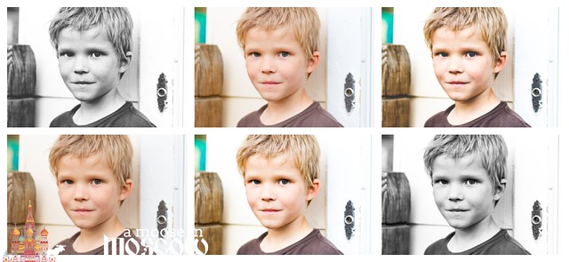
First, the technical. The settings were: ISO 320, F/3.2, 1/250 sec. Shot in raw, edited in Lightroom. For those photography nerds out there.
Here’s the unedited photo, just converted exported from the raw file to show you how it looks. It still looks okay, but a bit flat.
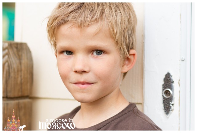
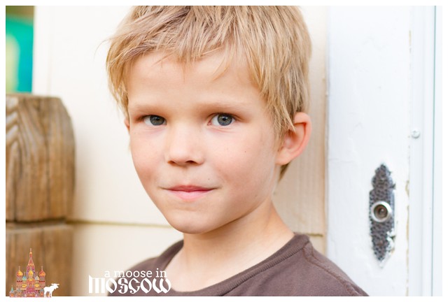
The being said, I really like the way that the light is hitting his eyes.
This next edit is a pretty light edit. This is how I’d edit a picture of my kids playing in the grass on a beautiful day. Just simple and bright. It’s okay, but it’s not what I was going for with this portrait of Reed. Too peachy and smooth. It barely looks different.
If we’re going for Goldilocks here, this is the opposite of the one above. It’s way too contrasty and dark. I have a matte edit which I was a huge fan of for awhile, but it really looks too heavy-handed on most portraits of my kids. The beautiful light in his eyes is practically gone which how much contrast was added here. And there’s also a ton of “clarity”, which adds that roughness to his skin. It’s the kind of thing you see in a portrait where they are trying to emphasize grit, but I’m not a fan of it here.

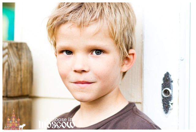
This was my favorite color edit while I was playing around with the processing. Now, it looks bright to me, but it’s a pretty straightforward edit. Just contrast and sharpening added. I think it would be fine if I made it a bit darker still on his skin.
So, into the world of black and white.
Here’s a matte black and white. It’s okay. I’m good with it. Love? Eh.
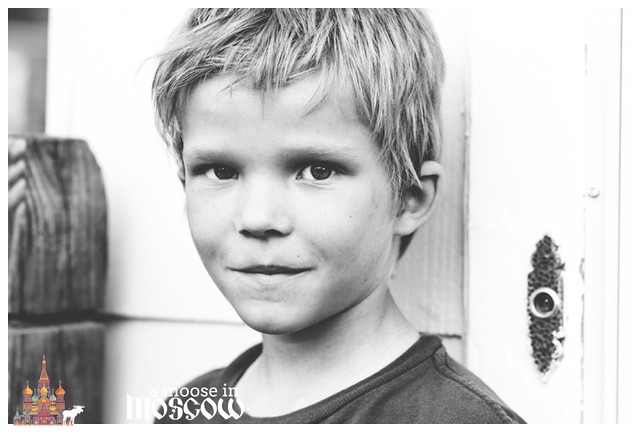
But, this photo is my favorite of all of them. I love the simplicity and intensity of it.

There you go. One photo, six ways. Which is your favorite?

Neat! This post is a lot of fun.
Although I agree with you on the aesthetics of the edit and don’t favor them in terms of what makes a “great” photo, I really like the surprising way the “contrast”/”gritty” photo brings out an impish turn at the corners of Reed’s smile. On close inspection, that look is there in the original, of course.
I like the “bright” edit the best, mostly for the light in his eyes.